Material Identity

Material Identity
Material Identity is a chair inspired by the styling principle of Charles Lock Eastlake. His book Hints on Household Taste, was a best seller in England and America in the years following its publishing in 1868. Ironically, Eastlake's treatise expounds on commentary equally relevant today. He said that public taste is corrupt - fashion rules, and few are shocked by sham and pretension. Cheap and easy method of workmanship in an endeavor to produce a show of finish with the least possible labor, as well as an unhealthy spirit of competition in regard to price, has continued to cause the value of our ordinary mechanic's work to deteriorate. The parallels today 100 years later are resounding.
Chair and seat constructed from pre-printed steel from recycled tin containers; aluminum, sterling silver and 10k gold rivets; stainless steel screws.
Scroll below for more images and Artist Statement. This chair is a sculpture and not intended for seating.
Dimensions: 38.25"H x 17.25" W x 14" D
Available for purchase or exhibition.
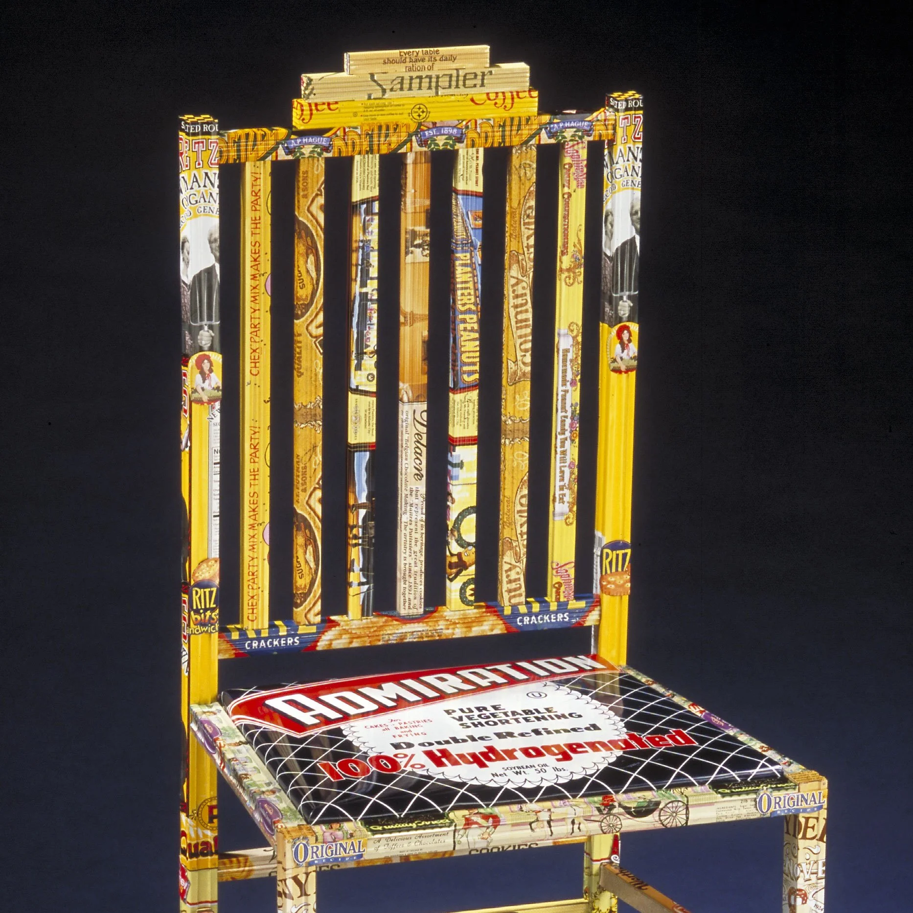
Historically, chairs have served as symbols to identify status and position. For centuries past, thrones clearly distinguished kings and queens. At meals, the nobility and honored-guests sat “above the salt” while more lowly guests sat “below the salt.” Even today, the chair at the end of the table is reserved for the head of the household. Each person at the table has a chair at the family table.
In the grocery store, whether above the salt or below, the marketing of consumer products works to create a sense of identity with the consumer. “According to advertising guru James Twitchell every symbol, from Alka Seltzer’s Speedy to the Energizer Bunny plants powerful notions of who we are.” [1] Consumers are enticed to buy products based on branding, a learned response to identify with a particular product. By choosing a particular brand of coffee, for example, you’re indicating your good taste or your social status. Similarly, does your childhood favorite chocolate appeal to you based on brand loyalty, or does the marketing of a “premium” chocolate heighten its appeal?
[1] Richard and Joyce Wolkomir, Smithsonian Magazine, page 103.

The seat cushion has the appearance of an actual seat cushion, but it is made from a very large tin can. It was chosen for the words, “Admiration” that goes across the top surface. I was thinking about how advertising cultivates and projects meaning for the products inside the tins. In this example, we are supposed to have admiration for large can of pedestrian vegetable shortening.

The close up image above of Material Identity Chair depicting desirable attributes like “original” and “quality” in pedestrian brand name products. A vintage tin for Mackintosh’s “Quality Street” Toffees and Chocolates goes around the edge of the seat cushion.
Look closely at the lower right corner of the photo below. Look very closely to see my hallmark stamped into the metal. It is a domestic iron with an electric cord.
Bermaid is written in tin can lettering across the back of the chair.
What does Bermaid mean?
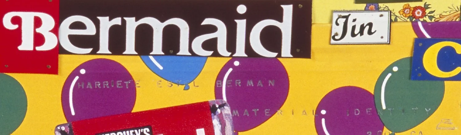
Bermaid is a pun on my last name Berman. Bermaid is analogy to this work being made by hand, and by a woman, a maid. Bermaid is a play on words. First, my last name - Berman - is not a very good name for an avowed feminist— it having “man” embedded in its ending. I replace “man” with “maid” to indicate to viewers that the artist is a woman and to suggest that the work is "made" by hand.
Look closely at the above photo (lower right corner) to see my hallmark, stamped into the back of the chair.
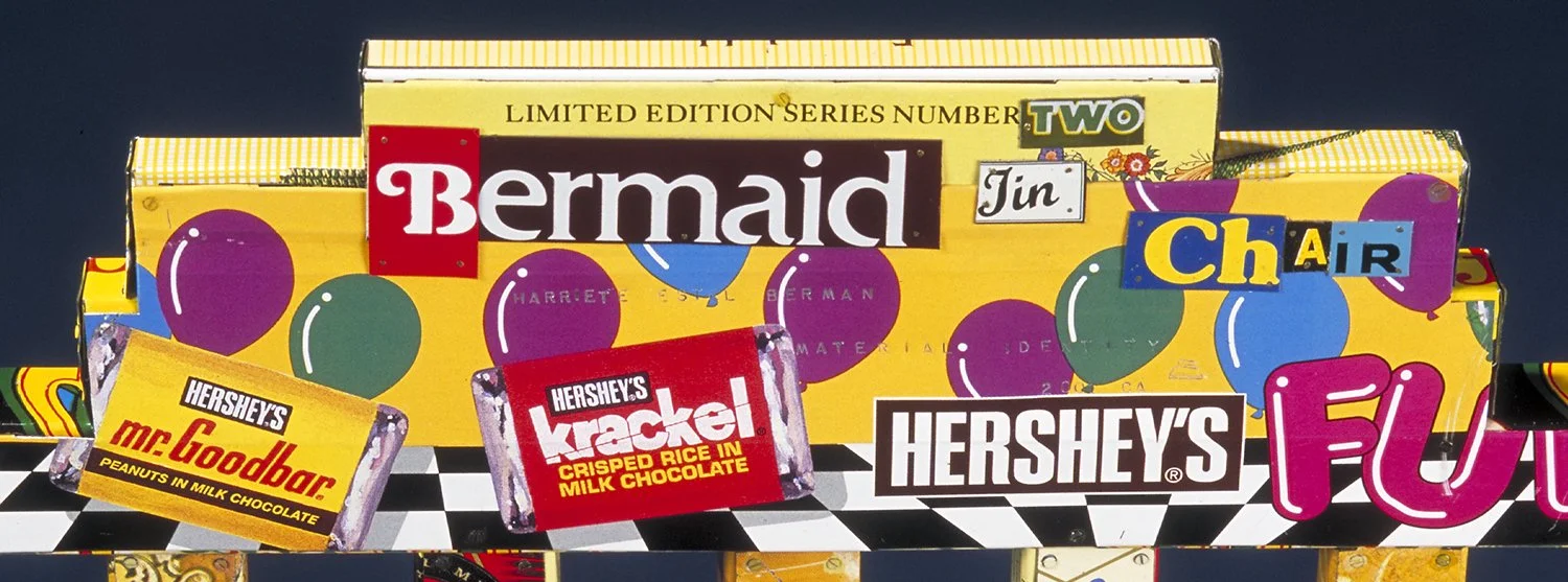
This photo above is a close up of the back of the chair.

Material Identity chair is included in the books 500 Chairs and Altered Art: Techniques for Creating Altered Books, Boxes, Cards & More.


© Harriete Estel Berman, 2021, 2025